This is a self-initiated concept project. It is not affiliated with,
endorsed by, or connected to The Fishin' Pig or any of its parent
companies.
UX/UI Redesign Concept · 2026 · Self-Initiated
The Fishin' Pig
A self-initiated concept redesign of a Virginia-based BBQ and seafood
restaurant chain spanning the full UX process — from competitive
research and information architecture through a token-based design
system and responsive high fidelity design across five pages.
Two websites. Six locations. Zero unified experience.
The Fishin' Pig operates two separate websites — fishinpig.com
built on Wix and fishinpigrva.com built on PopMenu — with no
unified brand experience, inconsistent navigation, and broken
online ordering on two of six locations.
Customers
searching for their nearest Fishin' Pig encounter a fragmented
brand that undersells what is genuinely a beloved regional
restaurant. The existing sites bury weekly specials, make
catering difficult to find, and offer no consistent path to
ordering online.
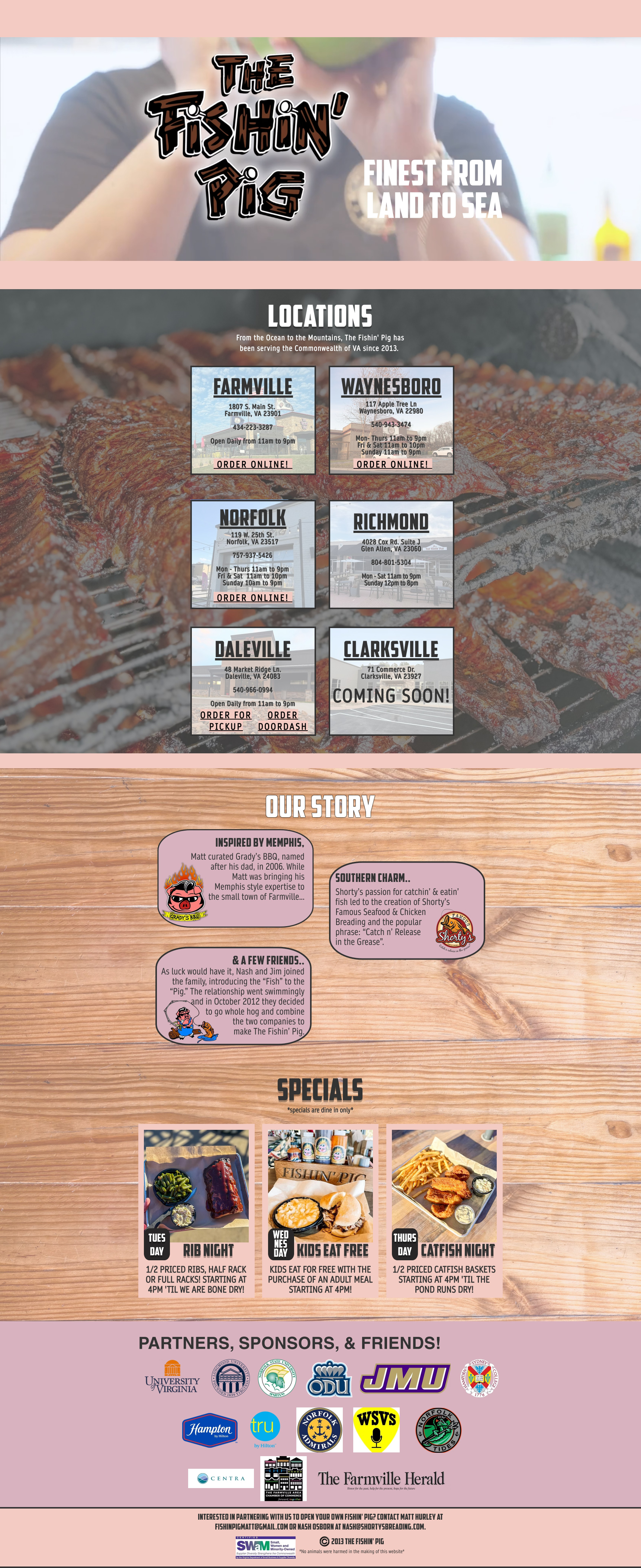
Before — fishinpig.com
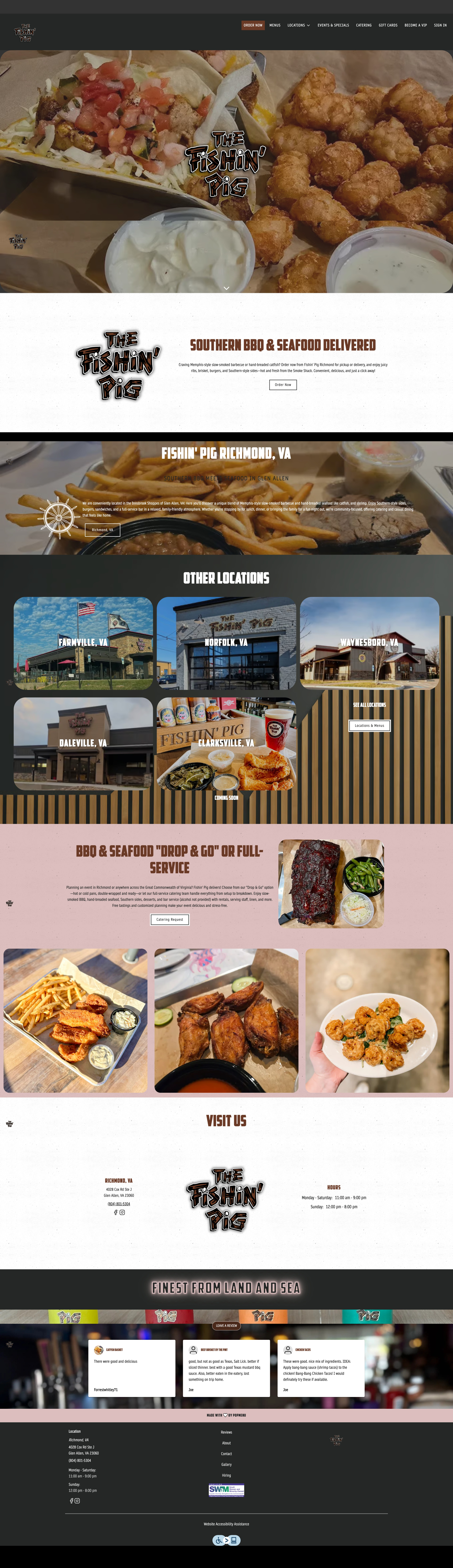
Before — fishinpigrva.com
Two websites on two platforms with different visual identities
Online ordering unavailable for Richmond with no explanation or
alternative
No communication about ordering availability — users left
stranded
Weekly specials and catering buried in navigation
No unified location finder across both sites
Inconsistent photography and brand voice
Six separate Instagram accounts with no unified brand strategy
Research
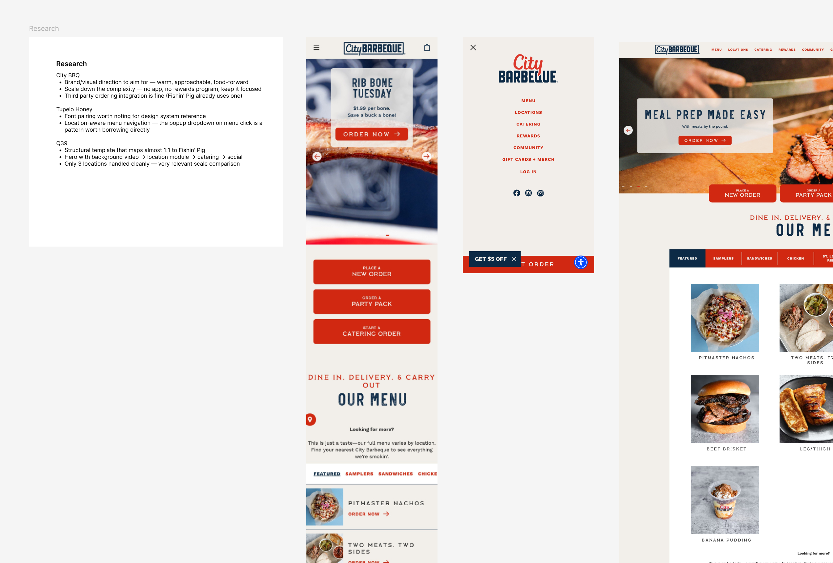
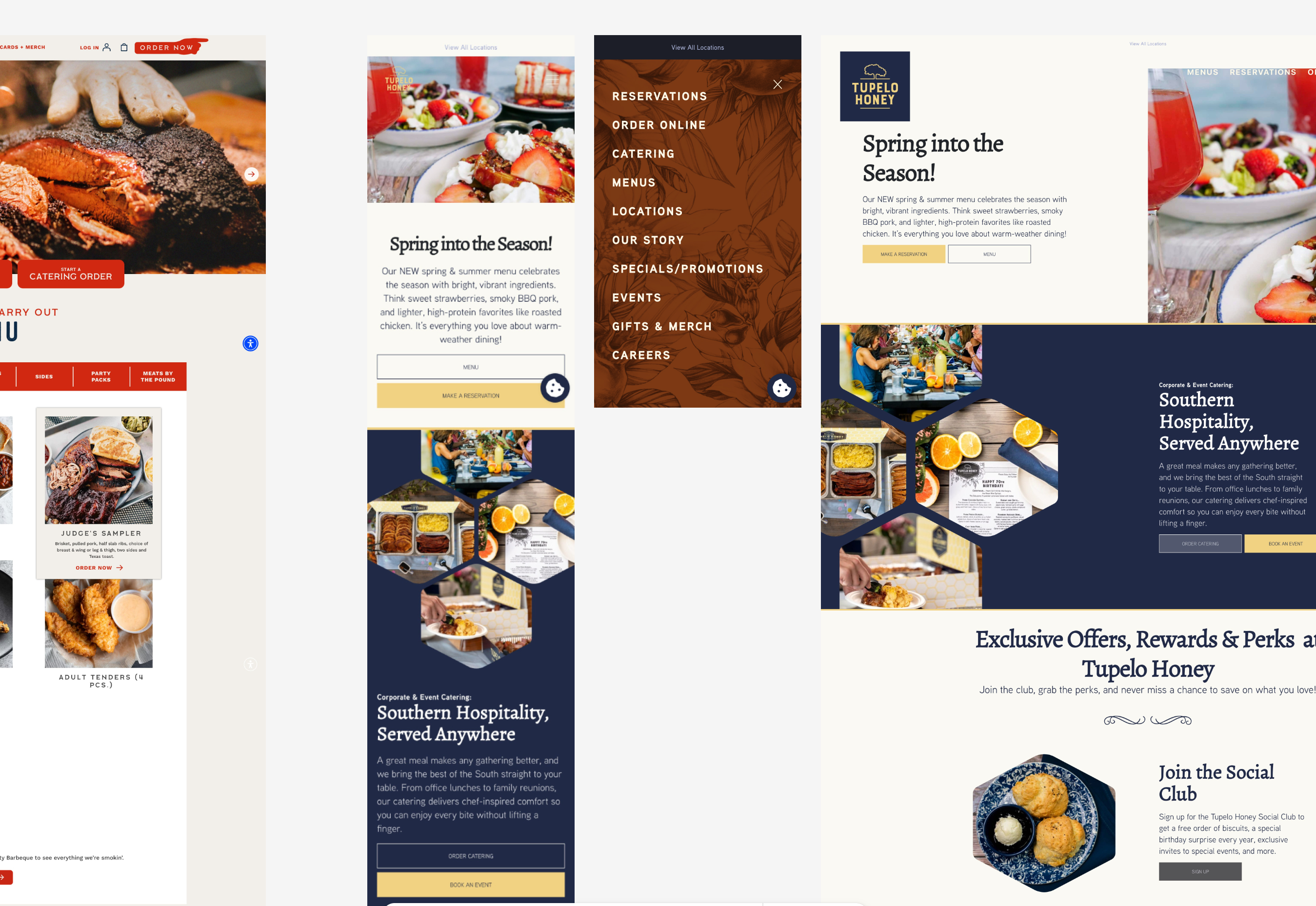
Competitive Analysis
Benchmarked three direct competitors to understand industry
standards for ordering flow, navigation, and brand consistency.
City BBQ — strong ordering flow, location-aware menu,
proprietary app
Q39 — closest structural match — video hero, location module,
catering section
Key takeaway: All three had unified websites, clear ordering
flows, and strong brand consistency. Fishin' Pig had none of
these.
User Personas
Five distinct personas identified based on the brand's customer
base and location context.
The Hungry Local — regular, needs quick ordering
The New Visitor — unfamiliar, needs discovery and trust
The Returning Fan — loyal, interested in specials
The Vacationer — passing through, needs geographic context
The Catering Inquirer — planning an event, needs pricing
Asset Audit
A thorough audit of both existing sites revealed significant
inconsistencies in brand assets and typography.
Multiple logo variations — no clear primary version
Mahogany #6A3A26 identified as primary brand color
American Captain font — licensing issues for web use
Weak photography — professional shoot recommended
"Catch n' Release in the Grease" — key brand asset
Shorty's Famous Breading — authentic sub-brand story
Information Architecture
Three rounds of IA iteration led to a final navigation structure
that unified both sites into one coherent experience — elevating
the content users actually need and burying nothing critical.
Primary Navigation
Home
Menu
Locations
Catering
Specials
About
Utility Cluster
Order Now
Account
Shop
Location Architecture
Master Locations Page
Individual Location Pages
Locations given prominent nav placement
The most common user need after ordering. Previously buried or
inconsistent across both sites.
Catering elevated to primary navigation
Previously a buried link. Elevated to primary nav with a full
dedicated page.
Specials as a dedicated nav item
Previously impossible to find. Tuesday Rib Night, Wednesday
Kids Eat Free, Thursday Catfish Night all surfaced.
Order Now as persistent utility button
Always visible, never buried — a persistent CTA that follows
the user through every page.
Two-tier location structure
Master page for discovery, individual pages for depth —
serving two distinct user intents simultaneously.
Wireframes
Low fidelity wireframes for every homepage section before touching
color, typography or photography. The homepage spans 11 sections —
from a rotating story hero to a community-driven UGC gallery.
01
Single Contextual CTA Per Slide
Each hero slide has one specific action — View Menu, Our Story,
Book Catering, Notify Me. Reduces cognitive load and improves
conversion clarity.
02
Nine Location Card States
Standard, Unavailable and Coming Soon × Default, Hover and
Selected. The unavailable state communicates ordering limitations
without implying the location is closed.
03
Horizontal Scroll on Mobile
Specials, location cards and menu items use horizontal scroll with
a card peek pattern rather than stacking vertically — preserving
page length on mobile.
04
Around the World Section
Buried gallery content elevated to a prominent homepage section —
reframed as a community moment with location tags and a mascot
submission strip.
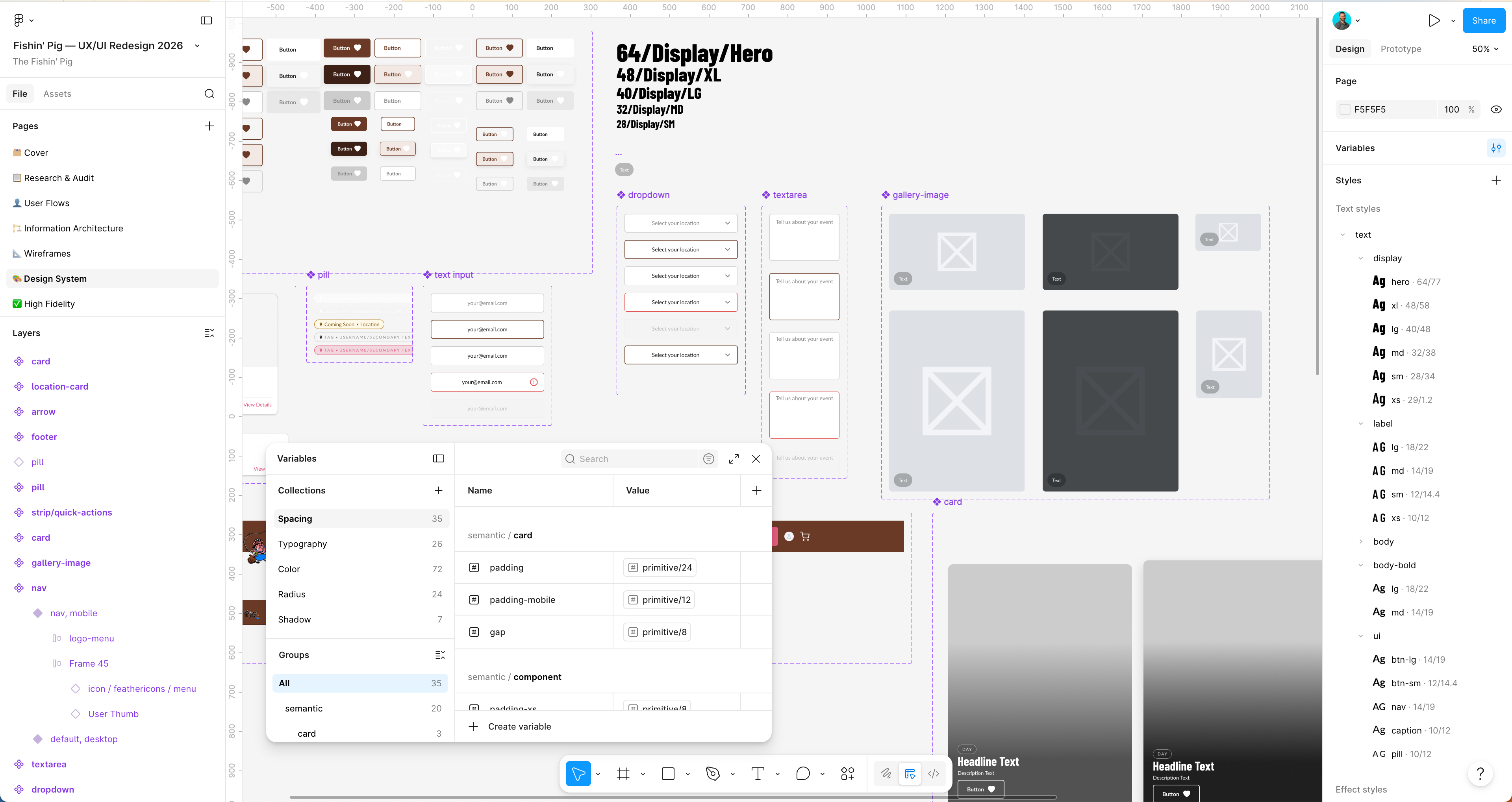
Design System
Color System
Mahogany #6A3A26
Brand Pink #E55A81
Gold #B07D1A
Neutral Dark #1A1A1A
White #FFFFFF
Every color combination checked against WCAG 2.1 before being
added to the semantic layer. White on mahogany — AAA compliant.
Brand pink standardized for the first time across all touchpoints.
Typography
Display — Barlow Condensed
Catch n' Release
Body — Lato
Finest from Land to Sea — warm, readable, complements the bold
display treatment.
Token Architecture
A two-layer token structure — primitive tokens (raw values)
referenced by semantic tokens (named purposes). Changing the
primary brand color once updates every button, border and
background simultaneously.
Text styles
24
Spacing tokens
14
Shadow styles
9
Location card variants
9
Button types
5
Pages designed
5
Component Library
Buttons · Pills · Input fields · Navigation (Desktop + Mobile) ·
Location Cards · Special Cards · Menu Cards · Quick Action Strip ·
Footer — all built on top of the token system with boolean
properties for variants.
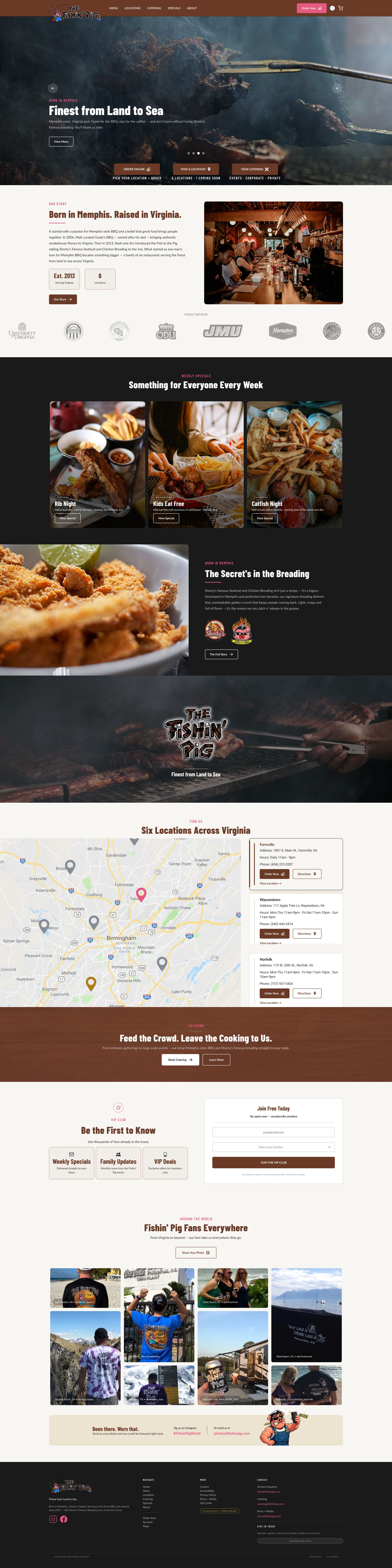
High Fidelity
01 / 05 — Homepage
The Complete Brand Story in a Single Scroll
The homepage tells the complete Fishin' Pig brand story —
from the rotating hero to the community-driven Around the
World section. The dark mahogany navigation establishes
immediate brand authority. Alternating light and dark
section rhythm creates visual interest while guiding the
user through a deliberate content hierarchy.
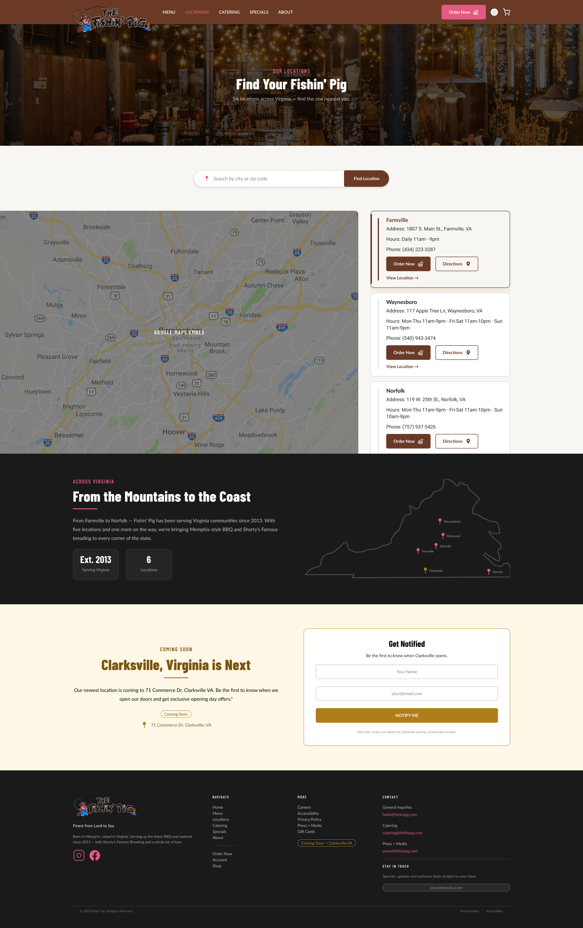
02 / 05 — Master Locations
Discovery at a Glance
The master Locations page serves users who need to find
their nearest Fishin' Pig quickly. An embedded map with six
location cards — each in the appropriate state (Standard,
Unavailable, or Coming Soon) — gives users an immediate,
honest picture of what's available near them.
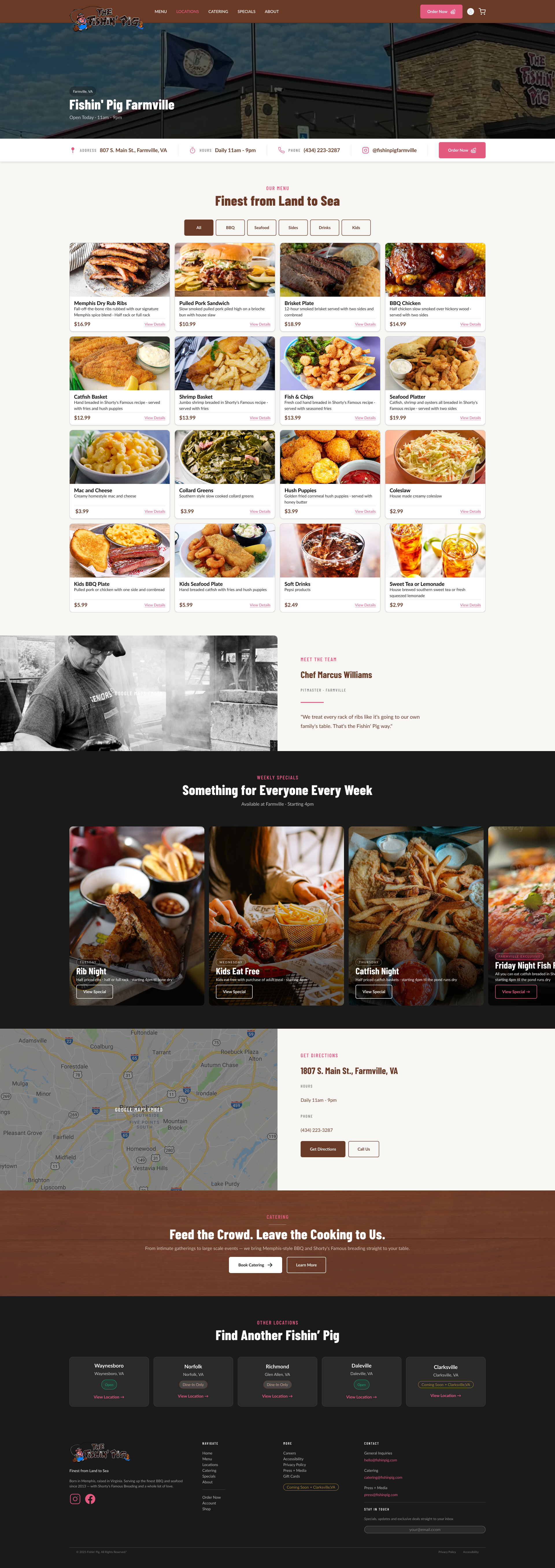
03 / 05 — Individual Location
Farmville — Depth for the Curious User
Individual location pages serve users who want to go deeper
— see the space, check location-specific specials, and get
directions. The Farmville page demonstrates the full
template including the pitmaster profile, location gallery,
and hours module.
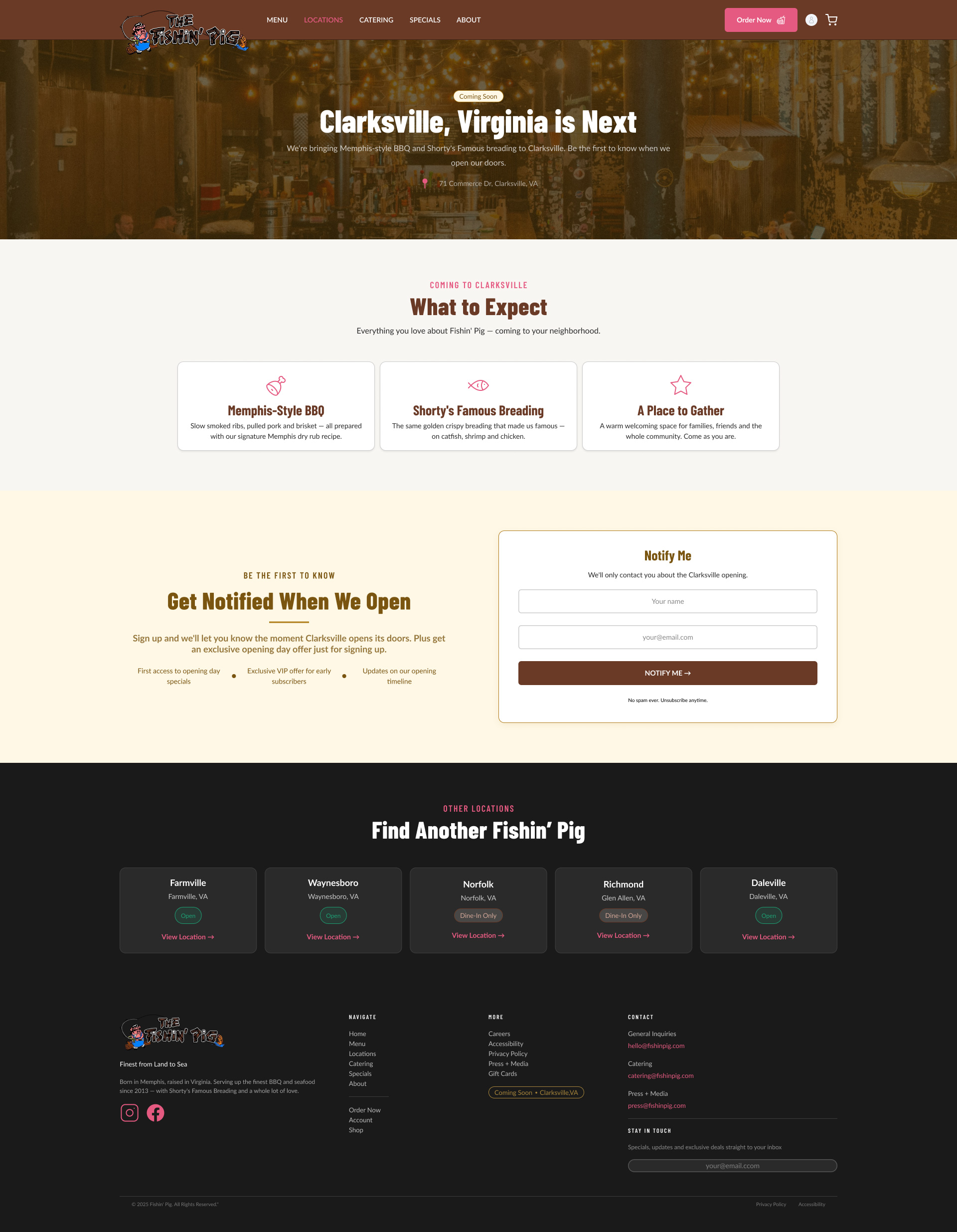
04 / 05 — Coming Soon
Clarksville — Turning Absence into Opportunity
The Clarksville Coming Soon page transforms an opening
announcement into a lead capture moment — a Notify Me form,
a What to Expect section, and anticipation-building copy
that turns the new location into an event rather than a
footnote.
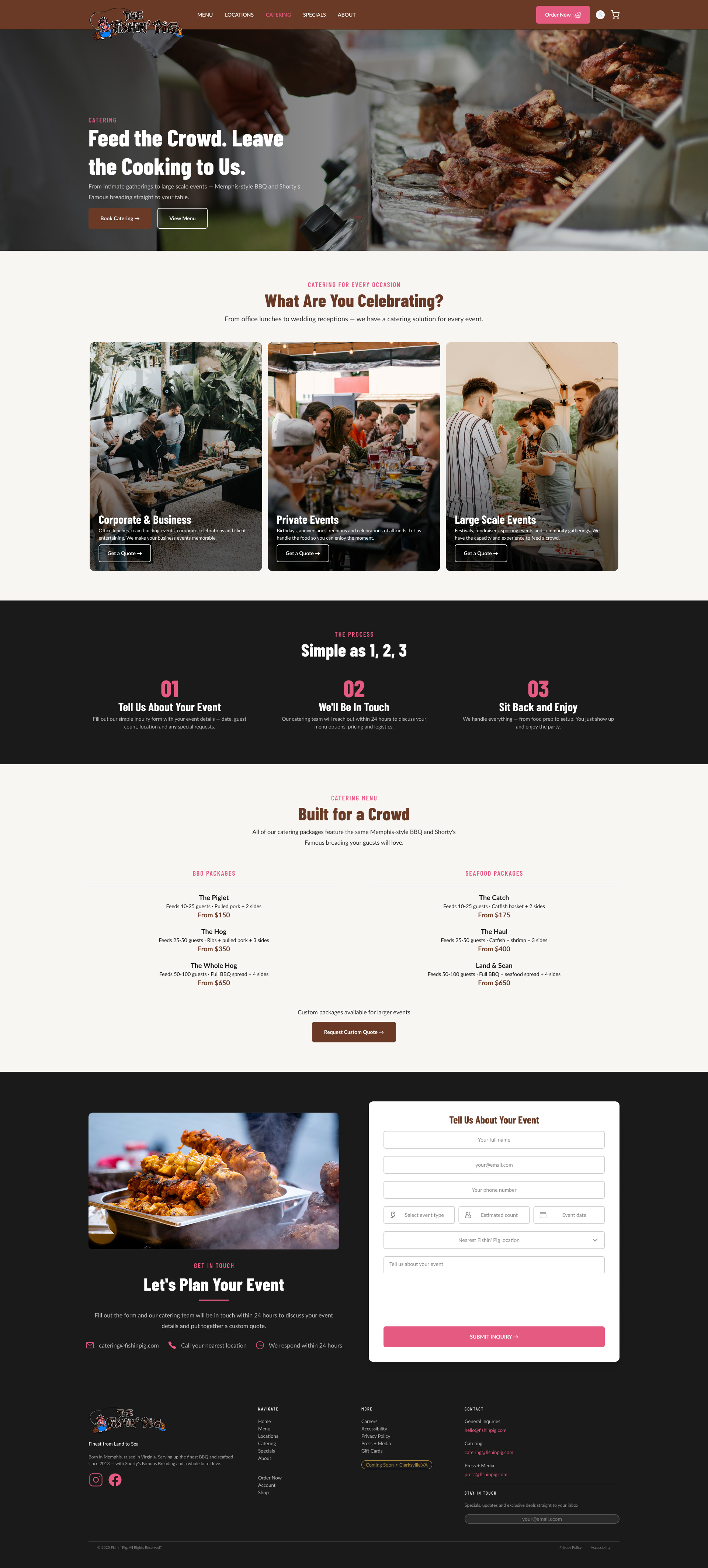
05 / 05 — Catering
Structured Around the Decision Journey
The catering page answers each question a prospective
customer would have in sequence — What type of event → How
does it work → What's the menu → Get a quote. Event type
cards use the same photo-forward treatment as the Weekly
Specials cards for visual consistency.
Results
Problem → Solution
Problems identified and solutions implemented
Two fragmented websites
One unified design system covering all six locations
Broken ordering with no communication
Nine card variants handle every ordering state with honest
copy
Buried specials and catering
Specials elevated to homepage. Catering elevated to primary
nav
No unified location experience
Two-tier architecture serving every user intent
Inconsistent brand pink
#E55A81 standardized with ADA compliant usage guidelines
No community engagement
Around the World transforms buried gallery into a community
moment
Clarksville with no digital presence
Coming Soon page with Notify Me lead capture
No responsive mobile experience
Full responsive design across all five pages
Metrics to Track Post-Launch
Online ordering conversion rate
Catering inquiry form submissions
VIP email signup rate
Clarksville Notify Me signups
Bounce rate reduction on location pages
Time on site
Local SEO rankings
Recommendations
01
Professional Photography Shoot
The single highest impact improvement available — food,
exteriors, atmosphere and team portraits across all six
locations in a single shoot day.
02
Platform Consolidation
Consolidate onto WordPress with a white label ordering
integration such as ChowNow or PopMenu — solving unified brand,
single CMS, and consistent ordering flow.
03
Unified Instagram Strategy
Consolidate six location accounts to one brand account managed
centrally — enabling Instagram API integration for the Around
the World section.
04
Content Governance
Branded social media templates, centrally managed content
calendar, brand guidelines document and a DAM system for
centralized asset storage.
05
Clarksville Opening Campaign
Pre-opening email sequence, social media countdown, and
exclusive opening day offer for Notify Me subscribers — turning
the launch into an event.
06
SEO & Structured Data
Schema.org LocalBusiness markup on all location pages — address,
hours, phone and geo coordinates — directly improving Google
Maps visibility and local rankings.
Reflection
Design systems are worth the investment
Building the token architecture before touching high fidelity
felt slow at first. But every high fidelity decision became
faster and more consistent because of it. Changing the primary
brand color once updated everything simultaneously.
Research changes everything
The discovery that Fishin' Pig had two separate websites, six
separate Instagram accounts and inconsistent brand pink across
all of them fundamentally shaped every design decision. Without
that research the redesign would have been surface level —
prettier but not meaningfully better.
Constraints are creative fuel
Working without a professional photography budget, without white
versions of the logos, without licensed fonts forced creative
solutions — Screen blend mode for logo reversal, Barlow
Condensed as a Google Fonts alternative, placeholder photography
with a documented shoot recommendation.
Content strategy is UX
The decision to elevate the Around the World gallery, surface
the weekly specials, and give catering a dedicated page weren't
visual decisions — they were content strategy decisions. Where
content lives determines whether users find it.
Final Thought
The Fishin' Pig is a genuinely great brand hiding behind a website
that doesn't do it justice. The Memphis heritage, the Shorty's
Famous breading story, the community of fans wearing the merch
around the world — all of it is there. It just needed a
design system, a unified experience and someone to tell the story
properly.