UX/UI Redesign · 2025 · SIDEARM Sports
University of Alberta Athletics
A UX/UI redesign of the University of Alberta Golden Bears and Pandas athletics website — improving fan access to schedules, scores, and team information across desktop and mobile.
The Problem
Fans couldn't find what they needed — especially on mobile.
The previous University of Alberta Athletics website made it
difficult for fans, students, and recruits to quickly access
essential content like schedules, scores, and team information —
particularly on mobile.
Its fragmented structure and
inconsistent visual system created friction in navigation and
weakened alignment with the broader university brand. Users
faced unnecessary barriers to engaging with athletics content in
real time.
- Schedules, scores, and team information difficult to find on mobile
- Fragmented navigation structure with inconsistent hierarchy
- Visual system misaligned with the broader university brand
- No clear mobile-first approach to high-demand content
- Friction across key user flows for fans, students, and recruits
Process
-
Problem
To identify core pain points, I worked with stakeholders from the University of Alberta to define audience needs and project goals, then benchmarked against leading collegiate programs like Alabama, Georgia, and Ohio State. Combined with a focused audit of the existing site, this revealed key gaps in navigation, content hierarchy, and mobile usability.
-
Research
Research focused on how users access collegiate athletics content, highlighting the importance of fast access to schedules, scores, and team information — especially on mobile. These insights reinforced the need to simplify navigation and prioritize high-demand content throughout the experience.
-
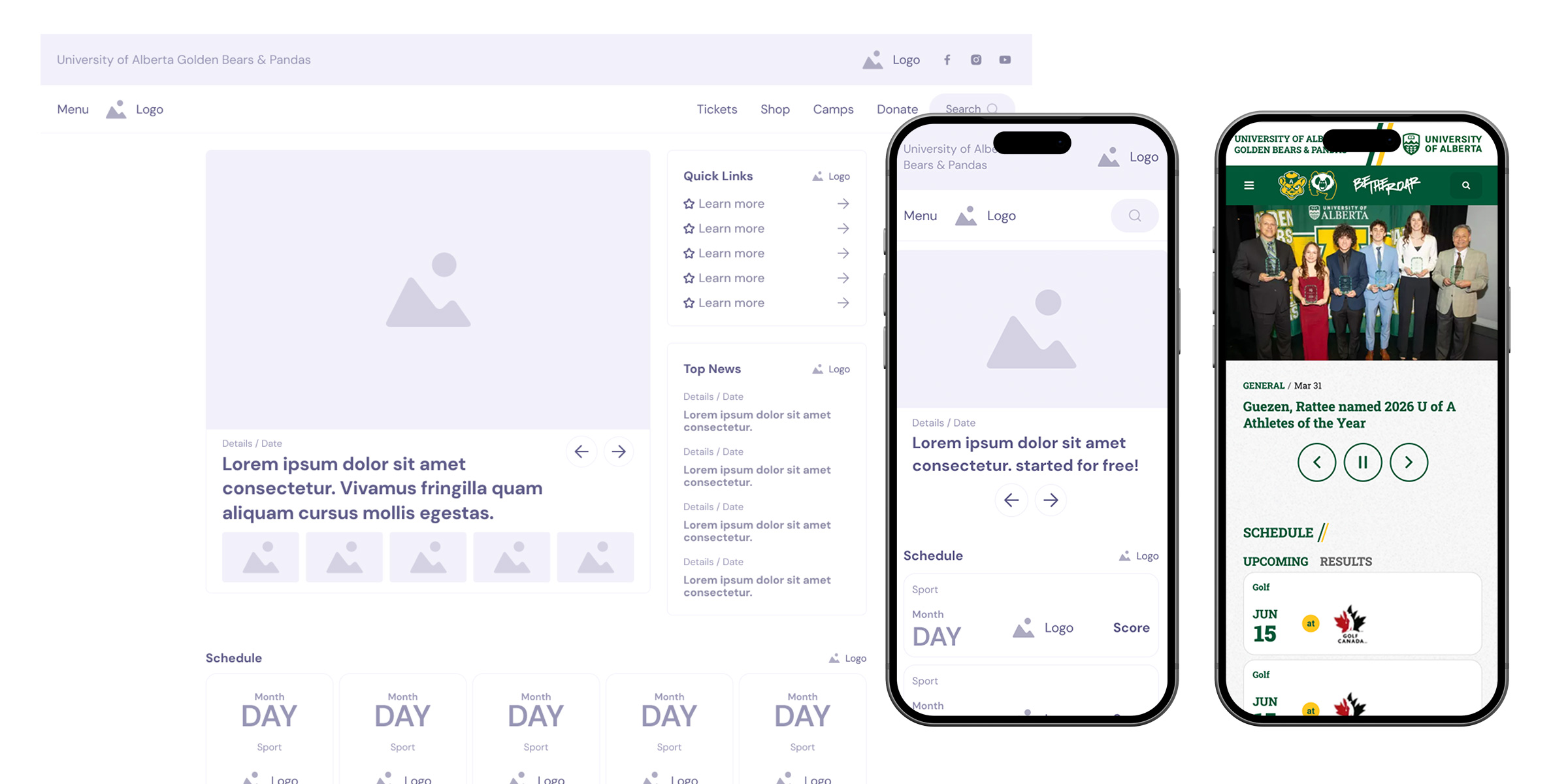
Wireframes
Wireframes focused on restructuring the site around primary user goals — prioritizing quick access to schedules, scores, and team information. I simplified navigation and clarified content hierarchy to reduce friction across key user flows, validating structure and usability before applying visual design.
-
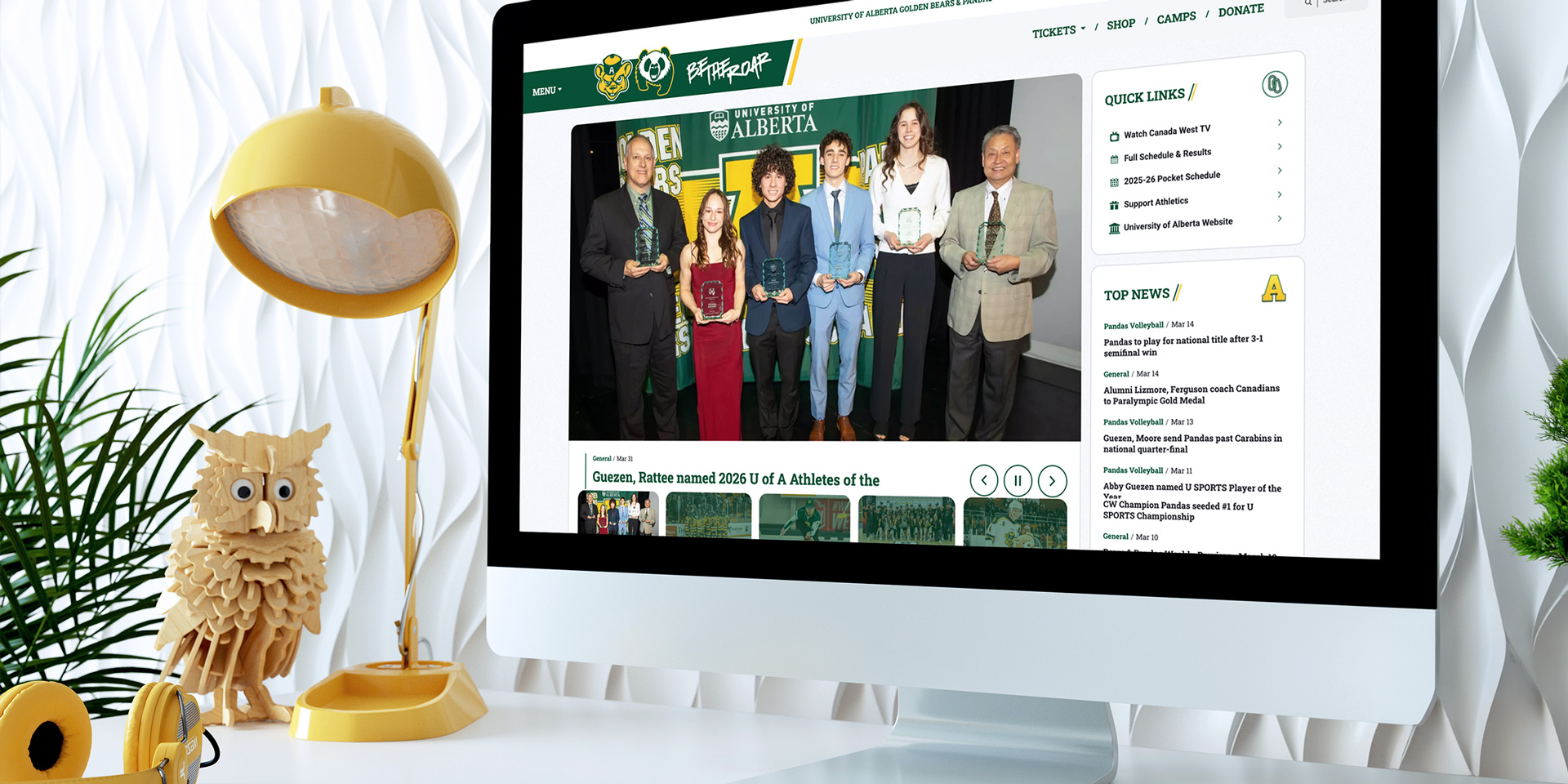
Final Design
The final design aligned with the university brand and streamlined access to schedules, scores, and team pages. Key features included a full-window slide-out menu, a scrolling schedule card module, and an animated featured stories section — standardizing hierarchy, reducing friction, and improving mobile usability.
The Work